Canary Cove, Maine

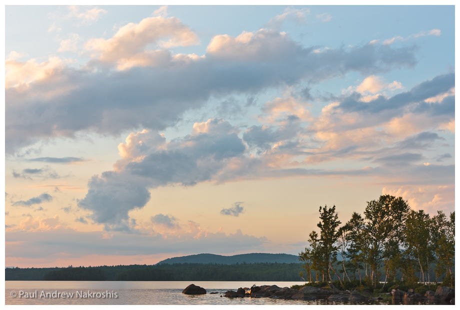
During my semester break, I have been going through my image library—adding keywords, deleting bad images and picking images that I want to use when I eventually go on to redesign my portfolio at www.paulandrewphoto.com—and I came across this image that I made back in September of 2010. I pass by this little nub of an island many times each week, and for most of the time, it’s not very photogenic. The evening I made this image, a thick fog bank was lifting off of Blue Hill bay, and I managed to be passing by as this scene unfolded.

The fog erased the background from view, which is normally distracting and by doing so, created a simple, beautiful scene which allowed me to create an image that I think is worthy for inclusion in my portfolio.

White Balance in Architectural Photography

I just finished editing a set of architectural photographs for Steve Prescott of Fiddlehead Designs in Brunswick, Maine. This is a total kitchen redesign he recently finished for a client. Steve did all of the cherry cabinetry for this job, and he had custom glass created locally for the cabinet doors. It’s an impressive job, and anyone who has had any experience with woodworking will immediately notice the attention to detail from the matching of wood grain, to the extremely uniform reveals and excellent joinery.

Photographically, the job required an extremely stable tripod, as I wanted to show the kitchen in the lighting conditions actually present in the kitchen. I used the available light to photograph everything, and this meant at ISO 100, exposures of around 2 seconds at f/11.  The most challenging aspect (that threatened to take even more post processing time than I  wanted to spend) was the very blue (and very bright!) outdoor light streaming in through  the windows, while the indoor color temperature was due to the “warmer” tungsten lights (It drives the physicist part of my brain absolutely nuts to call blue light “cool” and red light “warm”—who came up with this?). The best way to have dealt with this would have been to have to drop the window shade, but that would have made my exposure times either very long or required me to go to higher ISOs than I like. So I used Photoshop CS5 to select the window area (and a few “cool” patches in the image) and applied a warming filter. Not perfect, but it made a marked improvement. Perhaps lowering the window shades would have been better? What would you do?

Lightroom 3, with its ability to correct for lens distortion and make manual adjustments made my 17-40 f4L lens into a pretty close approximation of a tilt-shift lens, and I could perform all these corrections on the raw images non-destructively. This is a completely fantastic feature, although it really seems to slow down processing of the images when this is enabled.

More images of this kitchen can be seen at this site.

The biology of seeing

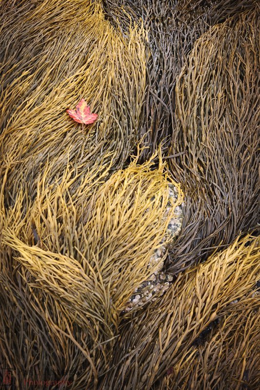
I came across this lone maple leaf on a vast lawn of seaweed at low tide. To me this image is about texture and contrast. Not a gorgeous scenic, but an intimate pleasing composition. My eye is drawn to the bottom third of the image where the rock is peeking out amidst three waves of seeweed, and then my eyes naturally wander to the maple leaf and the dark upper patch of seaweed.

On page 78 of her book, “Vision and Art, The Biology of Seeing”, Margaret Livingstone talks about work done by A. L. Yarbus, a Russian psychologist who put trackers on contact lenses on subject’s eyes and monitored where their gaze fell while they looked at a series of pictures. What he found was that people tend strongly to look at portions of the picture where there is fine detail and high-contrast. There is a striking picture on p. 79 of Livingstone’s book where she shows the results of Yarbus’ work. You can see superimposed on the painting exactly where one person looked.

I’ve never forgotten this, and now I try to pay attention to exactly where I look in a scene. A photographer I know (Richard Newton at Univ. of Massachusetts) once told me that a good photograph naturally leads one’s eyes around the image in a pleasing manner. I think this is good advice and Yarbus’ work tells us that we can use contrast and detail to help assist in making pleasing compositions.

Family Portrait

Even though the post date of this entry is September 23, 2010, I’m writing this in January 2011 (WordPress used the exif data to decide the post date) and now that my semester is over at the University of Southern Maine, I’m catching up on some billing of old jobs. This portrait was taken in September of this past year and the image was converted to greyscale from Lightroom 3.3 using Nik Software’s SilverEfex Pro plugin. The print was made by White House Custom Color (whcc.com).

I am consistently impressed by the print quality from WHCC— any faults in prints are invariably because I did not pay close enough attention to my submitted files. I would highly recommend this company for any photographer not able to afford their own large format printer.

Brooklin, Maine at 72 MP

My family has recently moved 3 hours north of Portland to a rental in Brooklin, Maine (hence the dearth of images this summer!). Here’s a beautiful point of land in Blue Hill Bay and mere 15 minute hike from our house.
Now, if the 72 megapixel header in the title of this post got your attention, you’re probably wondering what camera sensor I have gotten my hands on…the answer is that it’s not a new sensor, but a true resolution enhanced image created from 5 bracketed tripod-stabilized images fed into PhotoAcute, a great program for the Macintosh that can give (roughly) a doubled resolution image. That’s double in each dimension, or  not quite double, as my 21 MP image
only increased to 72 MP (a true doubling of resolution would create an 84 MP image). If I had the  time to post the 5 bracketed images here as well, you’d see that the program did a great job of exposure blending.
More frequently, if I find myself at a spot and I have some sense that I might have  a good image, I will take multiple exposures (PhotoAcute likes 5 or more) because in the back of my mind, I know that I can improve the image quality and size considerably using PhotoAcute. Also, it does a great job of increasing the dynamic range captured.
The downside is that processing five 21 MP images takes a LOT of time—about 8 minutes on my 3 year old 17″ Macbook Pro. It makes the cooling fans come on and it takes Lightroom3 a good few minutes to export a jpeg out of the 428 MB DNG file that PhotoAcute creates. Yes, it creates a DNG, which you can then touch up (if needed) in Lightroom 3.

Isle Au Haut, Maine #1

Recently, my wife and I spent a day (sans children) hiking on Isle Au Haut, a 10 km ferry ride from Stonington, ME. Isle Au Haut has about 45 year-round residents, and much of the island is part of Acadia National Park. Due to it’s remoteness, it’s the least visited part of Acadia (actually, I don’t have any data on that, but I’d bet you a nickel it’s true). There are only two rangers on the island and part of their job (aside from being incredibly friendly and knowledgeable) is to make sure everyone that entered the park in the morning leaves at the end of the day on the last ferry.

This will be the first of several posts on the trip, and I’ll include a photo or two with each post.

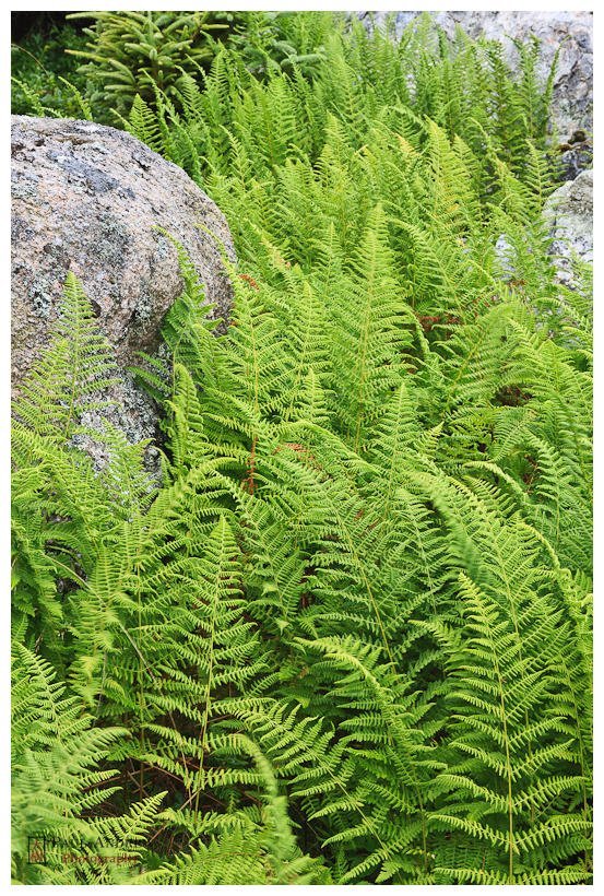
Today’s photos, the ferns (A) and the beach rocks (B), are taken at Duck Harbor (southwestern part of the island), and Squeaker Cove, respectively.

Duck harbor was where I first noticed that Isle Au Haut has some of the largest uninterupted fields (except for large boulders and occasional trees) that I have ever seen. These fields are so densely packed with ferns (I believe in this case, hay-scented ferns) that they seem to have crowded out many other species of plants. The visual effect is amazing, and the soft overcast light made photographing the fields quite pleasingly simple.
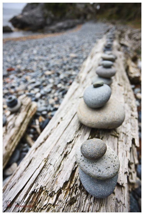
After a short hike up and over Duck Harbor Mountain, we arrived at Squeaker Cove. Beautiful smooth granite stones line the beach, which inevitably prompts people to create little cairn scultpures, many of which you can see here.

Incidently, when we arrived at the next beach at Deep Cove, which is populated by similarly smooth granite stones, my wife stepped in such a way that two of the polished stones slid against each other and produced a noise we both spontaneously described as a squeak, hence our theory that this is behind the naming of Squeaker Cove.

I have no idea if this theory has any truth to it, but it’s a good sounding theory. So there.

I hope you enjoy the images. More about hiking on the island in the next post.

Breaking the rule; sometimes the subject is in the center!

My family (last weekend) stayed for several nights at Maine Huts & Trails’ Flagstaff Lake Hut which is on the northeastern shores of Flagstaff Lake. To the south lie the Bigelow Mountains (whose peaks the Appalachian Trial passes over). It’s a beautiful location where the nightime sounds are consist of owls and plaintive loons, and some of the darkest night skies I’ve seen.

The actual story behing the creation of Flagstaff Lake still leaves a bad taste in many people’s minds—read more at this link.
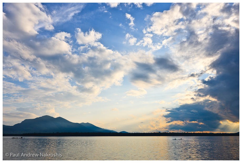
Despite the history, the hut is situated in a beautiful spot and landscape photography opportunities abound. Our first night there, a short walk down a peninusla, and we were treated to a peaceful sunet with some dramatic light.

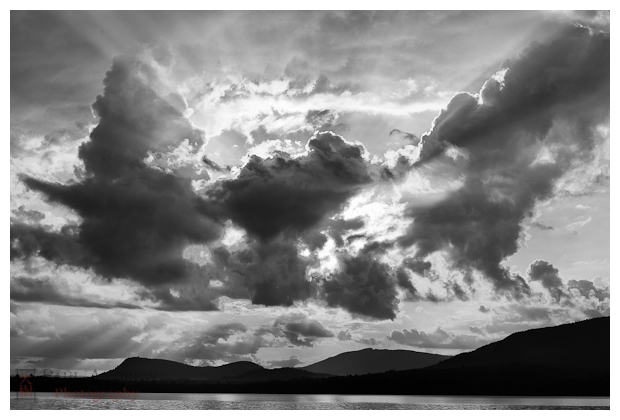
I could see, as the sun lowered in the sky, that it was soon going to be behind the clouds and anticipated the rays of light, and deliberately underexposed this image slightly to help preserve highlight detail.

But how should I frame the scene? Conventional wisdom is to not center your subject in the frame (and for some people not to take a photograph of a sunset!); so if you say that the sun & the dark central clouds are the subject, I’ve clearly violated this rule. In many cases, this rule is a good one to follow, since a central subject placement can me very static (i.e. boring). So, is there another framing of this scene that would be better?

Perhaps, but my eye sees this image as well balanced with the heavy blacks at the bottom third of the image and the sky occupying the rest. Furthermore, the dark edges of the clouds form a “v” shaped (or a nearly oblique line rising from left to right). I find the shapes of the mountains make my eye wander naturally from bottom right to bottom left and then up toward the sun and clouds. The sharp contrasts lead my eye around the image naturally, and in a way that seems pleasing to me.

I like this image, and I think the framing works well. I think this image is a good example of when it’s a good idea to ignore the “rule” of avoiding central subject placement.

Technical details:  this image was 1/640 sec at f/8.0 70-200mm f/2.8L at 70 mm, ISO 100 -1/3 EV, processed in Adobe Lightroom 3  and converted to B&W using SilverEfex Pro.

Abandoned Farmhouse, Durham, ME

Garry Winogrand is famous for saying that pictures DO NOT tell stories, but I wonder what his thinking was behind that stance. Look at this image—isn’t there a story here? We of course don’t know exactly what the story is unless we met the current or former owner and asked them, but in true “Sherlockian” (is that a word?) fashion, we can make some pretty good guesses from what we see here. I see a house in serious disrepair (not seen in this image is the fact that the foreground floor is totally rotted out), but also with modern insulation indicating that someone was thinking of doing some work on the house, and also modern cleaning products as if someone was set to clean the house. The fact that this room is not really functional, means that there’s probably other sections of the house that are in better condition—maybe those are the rooms the cleaning products were meant for. Perhaps this room was used as storage? What to make of all the keys on the wall? Somone went to the trouble of bracing the door too, which tells me they cared to get into this room relatively often. So I see a house that has likely been lived in recently, and that someone set out to repair, but for some reason has not done so. Why?

The photo brings up more questions than it answers, but there clearly is a story here, and my desire to understand the story behind abandoned houses like this is what makes these rural stuctures so intriguing to me.

This picture was about 1 second, handheld at f/11, made possible because the lens shade on my 50 mm f/1.4 lens allowed me to brace it up to the window which served to steady the camera and remove unwanted reflections on a bright sunny day.