 My main portfolio site is hosted at paulandrewphoto.com, and has been constructed and maintained with Apple’s iWeb since 2003 (if memory serves me correctly). However, I’ve never been completely happy with the lack of customizability inherent in iWeb, and I’ve tried to find some simple web design software (short of Dreamweaver) that I can use to create a more elegant and simple web site.
Finally, I found a nice solution—Freeway Pro 5.5 by Softpress. I spent all day yesterday figuring out how to work the software, and once I made some serious progress, I became rather obsessed, and finished a working mock-up of the site, and didn’t go to sleep till about 3 am. (The down side of this was not so pleasant, as I had to get up at 6:30 to make breakfast for my kids and drive them to school this morning.) After dropping my kids off at school, I completely removed my old iWeb site and replaced it with the new improved version.
There are a few more pages to add, but the main work was going through my Lightroom library and culling through 1000+ images and choosing which images to include. I settled on about 7 black and white images, and 20 color images that I felt were a good representation of my work.
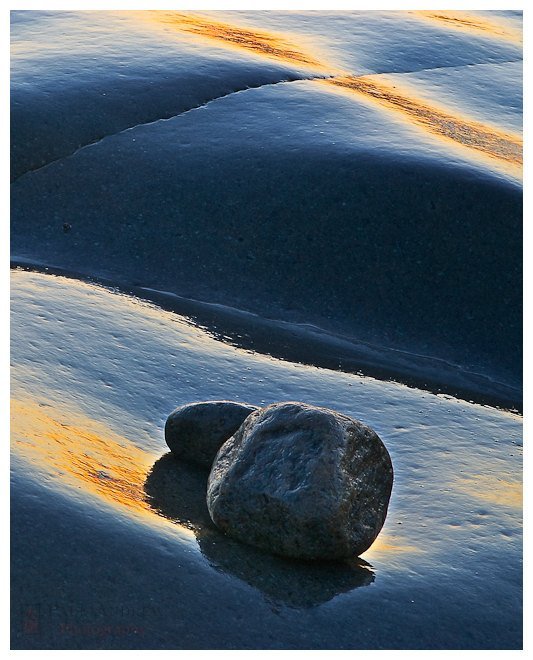
The interesting (perhaps somewhat demoralizing!) aspect of this process was how much more critical I have become of my own images. The more photographs I make, the more my older photographs seem to become flawed in some way. The image above is an exception to this general trend—I still find this to be a well-composed and pleasing image. But that’s a subject for another post—after I have a good sleep.
Do you find the same dissatisfaction with your older images in general?


